Eggbox

Eggbox in Transit - soon to be settled again!

A Very Musical June

By way of introduction…

I should start by saying that this blog post comes with a soundtrack, thanks to the magic of Spotify playlists.

Where I’ve been able to find the right songs or identify what was played in any way I’ve included them here.

(This is where I look sideways at Black Moth Super Rainbow – if anybody knows what their setlist was, please enlighten me somehow, as I’d like to include them in this playlist too.)

Continue reading

An idea – Q-Methodology in UX?

Why I think it could be useful and how it could be used

First, a disclaimer.

People can and do spend lifetimes working in this area. I have not done so. I am almost certainly cutting corners or just flat out being wrong on the internet. But I think that what I’m turning out is useful for a UX context. I may be doing a disservice to the techniques by dumbing them down or removing some rigour that would be present in a more proper application within the context from which they originate.  For this application, this is acceptable.  For other applications – particularly those relating to Health Psychology, you should seek better advice.

If you’re after a UX research technique to help you understand subjectivity and viewpoint, this might be helpful or interesting to you. If it is, then we’re good – but you might benefit from reading a little more about it.

What is Q-Methodology?

It’s a qualitative research technique, originally from psychology (particularly health psychology) which is used for understanding subjectivity. While it is a qualitative method, it produces numerical data, leading to it sometimes being referred to as a qual-quant methodology.

It helps reveal both consensus and divergence from consensus within a group of subjects. It characterises both that consensus and the divergence from it.

What is subjectivity?

Consider subjectivity as an opposite of objectivity.  If you are objective, you have taken your viewpoint out of the equation.  If you have not taken your viewpoint out of the equation, then you are exhibiting subjectivity.  Objectivity is an absolute, but subjectivity is not – it is individual to a person.  Understanding subjectivity means understanding a user’s attitude regarding a topic.

Why is understanding subjectivity useful to us?

When we are talking to users, we want to be objective, but we want them to be subjective.  We want to understand what their subjectivity is, what it means to them and what it should mean to us.

Consider where you have sent out a survey and two users have returned almost identical responses but when you interview them you discover that their identical responses are hiding wildly different concerns, interests or goals.  They might be doing the same things with different motivations, or they might have encountered the same problems but have felt wildly different impacts from them. They might both say that one flow is bad, but have very different reasons for thinking so.

The difference in these situations is often not in what they needed to do or how they achieved it (or failed to), but in their subjectivity – their attitude and viewpoint.

Terminology

Because I heard of this approach from a Health Psychology professor – albeit in an ad-hoc, unofficial fashion – I’ve researched it using sources arising from that field.  I’m using (or perhaps abusing) Health Psychology practices and terminology, which is not always the same as is used in UX or software related fields.  So, here’s a bit of a glossary:

Cohort – The body of individuals being interviewed.

Concourse – The wider body of discussion – this could be made up of notes, recordings and quotes from interviews, excerpts from online communities, support tickets or any other body of user-created statements.

Statements (aka. Q-Statements) – A representative sample set of short phrases, drawn from the concourse.  The subjective true-ness or right-ness of these are compared via a Q-Sort to understand subjectivity.

Subjectivity – see the introduction.

Q-Sort – A specific form of card-sort exercise, using the statements and performed individually with some or all of the cohort.  This is not the same as a QSort in software development terms, which makes googling a little bit harder.

How an interview series works

A quick summary

  • Build a concourse or find a pre-existing one
  • Prepare statement cards
  • Prepare the q-sort matrix
  • Run the interviews
  • Analyse the data

Step one – build a concourse or find a pre-existing one

If there is no pre-existing concourse, then a two-part session is possible – the first part should be a group discussion with several subjects about the matter under discussion, from which a set of representative statements can be drawn.

If interviews have been conducted on this subject in the past, notes or recordings from those may be used, although it is entirely possible that the subjectivity of your new interviewees may not match that of those interviewed previously.

Step two – prepare statement cards

The facilitator should prepare a set of statement cards, which should be drawn directly from the concourse.  The number of statements can vary a lot – a smaller set of statements will lead to a faster interview process, but you also may not gain as much insight.  You should aim somewhere between 10 and 100 cards.

  • Statements should be phrased as declarative statements. Some examples:
    • “It is the case that…”
    • “I must be able to…”
    • “I can…”
    • “It is important that…”
    • “It is good when…”
    • “It is bad when…”
  • One statement per card, one card per statement
  • The cards should all be uniquely numbered.
  • The same cards should be used in each session in a series

When creating statements, it is better to start fresh, but you could take typical “As a [p], I can do [x] to achieve [y]” story titles and rephrase them as “I can do [x] to achieve [y]” or even two statements – “I can do [x]” and “I can do [y]” separately.

The rephrase to remove the role is important, as including the role would affect how the statements are sorted.  This would provide a better-than-nothing set of statements to work with.

Likewise, separating the reason or end goal from the specific actions taken towards it lets you understand where subjects differing viewpoints may result in different actions for the same goal, or the same action for different goals.

Step three – prepare the Q-Sort matrix

At the start of each interview session, the facilitator should prepare a Q-sort grid.  The configuration may vary, but the following will usually be true:

  • It is a funnel-shaped symmetrical grid able to accommodate all the statement cards
  • There will usually be more than three columns – typically five, seven or nine.
  • The columns will have different heights to accomodate different numbers of cards each.
  • The central column will accomodate the most cards, outer columns the least, with a steady decline moving outwards. Often modelled on a normal distribution.
  • The columns will be labelled across the top and given a value.
Number of columns Example Leftmost label Example Rightmost label
7 Least true / most false (-3) Most true / least false (+3)
5 Least accurate (-2) Most accurate (+2)
9 Strongly disagree (-4) Strongly agree (+4)

Step four – run the q-sort interview sessions

  1. Run a one-on-one q-sort interview for each subject in the cohort
  2. The facilitator should explain that the exercise is about understanding viewpoint, and as such there are no right or wrong answers. The statement cards are also a talking point and may be discussed or talked around. These sessions can be recorded as if they were any other interview – the cards and sorting exercise provide a framework for the interview as well as being an act of research on their own.
  3. The participant should sort the cards into the matrix, depending on how well the cards fit their understanding, interests or needs. If the session is being recorded with audio-only, the facilitator should ensure that the cards being discussed are each read aloud, and their eventual placement is made clear for the recording.
  4. After each session, the facilitator should document which cards were placed into which columns. They should do this by creating a record for each participant. That record should be a list of {card number, column score} pairs.


Step five – analyse the data

After the interviews, the facilitator can perform some simple analysis with (for example) excel.  There are several useful things which can be produced:

Heatmap – consensus

  • create a square grid with card numbers on one axis and column values on the other.
  • Fill each cell with the percentage of users who placed that card in that column.
  • Convert numerical values to a colour shade to produce a heat-map.
  • Use the heatmap to spot commonality or difference of viewpoints, and therefore identify consensus or an absence of consensus.

Fingerprint – individual viewpoint

  • For each participant, create a rectangular grid with card numbers on one axis and column values on the other.
  • Fill any cells where a participant matched card number and column number.
  • Overlay one fingerprint over another to identify commonality/difference of viewpoint.

Heatmap / Fingerprint comparison

Overlay a Fingerprint over the overall heatmap to identify where it varies or matches any consensus.

Fingerprint grouping

Identify similar fingerprints within the cohort and use these groups as a basis for persona creation – similar fingerprints imply a similar viewpoint.

  • Treat each fingerprint as a vector, determine the “distance” between fingerprints by subtracting one from the other.
    • The shorter the distance, the closer the subjectivities.
    • The greater the distance, the more different the subjectivities, and the greater likelihood that they should be different personas.
  • Two users might have same goals, same day-to-day activities, but have different subjectivities. This would indicate they are a different persona who happens to be in a similar role, but who operates in a very different way with different priorities or in a very different space.

Further analysis?

Data scientists and statisticians can then apply tools like Principal Component Analysis or other Factor Analysis to the results if they feel the need to do so. This may help with further definition of the most significant differences between uncovered subjectivities.
 

A mini-rant about “Delight” abuse in UX

I started writing this blog post over a week ago, but it stalled as I was hitting a bit of a mental wall with it. But then I saw this tweet, which summed it up nicely.

Just add “Delight” or “Delighters” to the bottom of that list. I’ve been feeling a lot of backlash from the UX world against them, which isn’t vastly surprising given the amount of complete hogwash which has been vomited forth about them.

But it does bug me. It’s another example of people who don’t really understand domain-specific terminology latching onto it, unwittingly abusing it… and then the “experts” deciding to blame the terminology and models instead of stepping back and thinking “how can we help people grok this better?”

The Kano Model is at the core of this terminology, but Maslow’s Hierarchy of Needs is a handy reference too.

The Kano Model

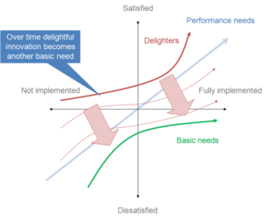
The Kano Model, Showing Change over Time.
Image By Craigwbrown (Own work)
CC BY-SA 3.0,
via Wikimedia Commons

But Dr. Noriaki Kano didn’t use the word “Delighter” originally, as far as I can tell.  The paper it’s all based on [Kano, N., Seraku, N., Takahashi, F., and Tsuji, S. 1984. “Attractive quality and must-be quality,” Journal of the Japanese Society for Quality Control (14:2), pp 147-156] uses “Attractive Quality”, and is mostly focussed on the following:

  • Attractive qualities give a satisfaction boost if they’re present, but their absence doesn’t cost anything.
  • Performance qualities give a satisfaction boost if strong but have a satisfaction cost if they’re weak.
  • Must-have qualities lower satisfaction if they’re not present, but their presence doesn’t give a boost.
  • Features move down that list over time. Attractive qualities gradually become performance qualities and then must-have qualities as they become more common and more people just expect them to be there.

I think the words “Delight” and “Delighter” were brought in later as a way to clarify what is meant by an attractive feature, but I could be wrong about that.  I’ve been unable to actually get hold of the original article to check – so apologies to Dr Kano if that’s incorrect.

The Problem

Before its use in UX land, I understand that the word “delight” in this context came from the hospitality business.  It came from the idea that just doing what was expected wasn’t enough to stand out.  Nor was doing all the typical “we’re a classy hotel” optional extra things because all the other classy hotels did them too.  You had to do everything which was expected by default, then do everything which might be considered as optional and then do something extra – something above and beyond.

The “bit more” on its own doesn’t cut it.  You’ve still got to do all the stuff before it. If you haven’t covered off the baseline stuff, it’s wasted effort and adds insult rather than delight.

It’s like building a ladder with only a top rung: of course it’s useless. It shows a fundamental misunderstanding of both the goal and the Kano Model. But that ladder is exactly what I keep seeing built, and then I hear complaints that blame the Kano Model and its delighters for it.

A fair number of people just saw the words “delighter” or “delight” and latched onto it, focusing on trying to create delight to the exclusion of all else. Because that always ends well.

The problem is that if all you have are delighters or attractive qualities, you’re in a situation where you have none of the other stuff.   I can assure you, whatever your designing, there will be some of the must-have qualities you are missing.

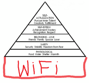
Think about the pyramid view of Maslow’s Hierarchy of Needs (with or without the popular additional “wifi” layer – this works either way).  This is a somewhat related idea.  That hierarchy works on the basis that the lower down needs must be satisfied before the higher up needs become meaningful, stable or sustainable.  Maslow’s idea was that the lower layers must be fully met before the higher layers can be achieved – without them, the pyramid collapses.

Origin unknown – I found it here: https://www.pinterest.co.uk/pin/552253973027755278/?lp=true

That idea is baked-in with the Kano Model too.  The satisfaction gained from one or two delighters or attractive qualities being present will be massively undermined by the absence of all of the must-have qualities and performance qualities.


Fancy wine with a personalised label and a box of chocolates might be a nice touch in your hotel room, but if the room is covered in faeces and crawling with cockroaches then it isn’t going to make your stay delightful.  It’s going to be insulting.

It’s only a delighter when placed in the context of everything else that might be considered having also been done!  Without that context, it’s just an inadequate attempt at a bribe.

But what really gets my goat…

It’s not really that exclusive focus on delight that annoys me, although it certainly doesn’t help.  That’s just the problem of a buzzword-heavy discipline which, on a superficial level, looks like an easy way to make a buck.

The UX industry will always attract people who’ll exploit the gullible by throwing buzzwords at them in exchange for money. They bug me, but what bugs me more is the misguided backlash from the people in the industry who should know better. The backlash against the models and techniques that are being abused and misapplied, whose names are being taken in vain.

I’m starting to see and hear UXers in positions of authority denigrating the Kano Model for being focused on the frivolous idea of “delight” to the exclusion of all else.

I don’t like it when people who don’t know the origins or meaning of domain-specific terminology muddle it with casual language.  It leads to a watering-down of ideas.  But I understand it and understand why it happens. You fix it by explaining and sharing understanding.  At a minimum, you just suck it up and cater for the terminology difference by using the appropriate terms for each audience.

But the backlash against the model itself because people don’t bother to properly understand it? Nope. Let’s just stop doing that, please.

Let things be things

The Kano Model is a model.  It’s a simplified abstraction.  It’s a useful model, but that’s all it is. While it’s useful, it’s not a world-encompassing ideology.  It’s a tool. I strongly suspect it didn’t come around to your house and force it’s filthy delighters into your face, shouting “DELIGHT! DELIGHT!”.

People who didn’t know better did that bit (not literally, I hope).

We can train most of those people out of abusing the models and terminology. We might even end up with more good designers as a result. But if we blame the models and terminology and steer people away from using them instead of understanding and explaining them better, we might as well give up and all go home.

Let’s not do that. Let’s just learn, use and teach our tools better.

Nine Worlds 2017 in sketchnotes – Part 3 – Sunday

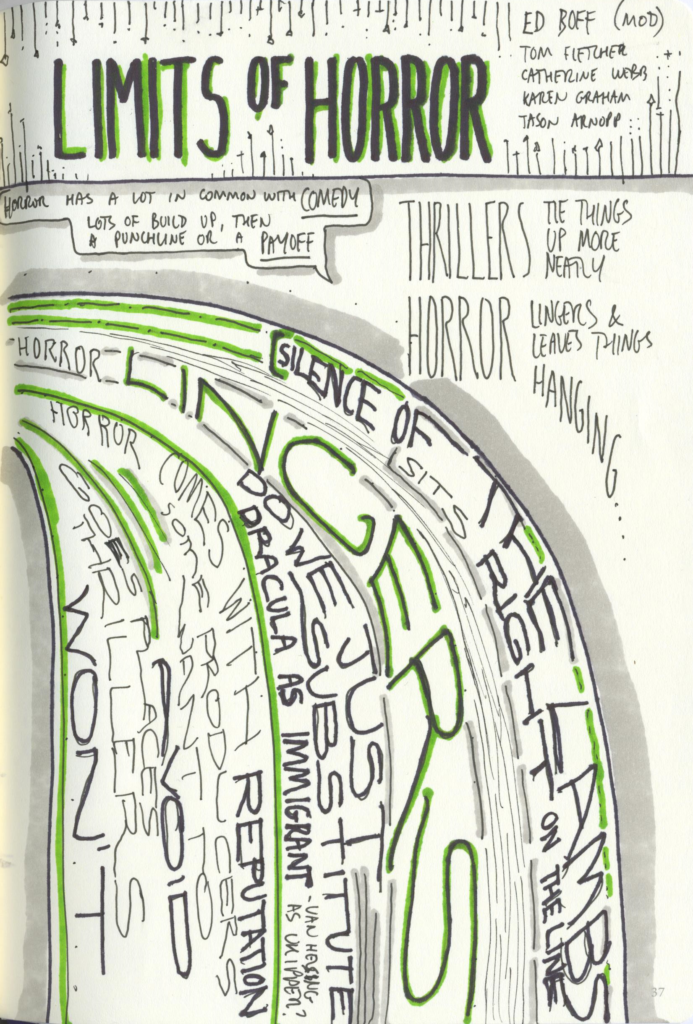
Limits of Horror

I had mistakenly included this in my Saturday sketchnotes before.  I’ve moved it from there and placed it here instead, so if it looks familiar, that would be why!

I confess this is one of my less readable sketchnotes.  But I like it because I picked a thematic layout and managed to largely stick with it all the way through.

Ed (a friend and the moderator of this panel) gently prodded the panellists enough that they could have a discussion in which he was also a participant without taking over… feeding in a few examples or cues along the way to keep things rolling, and also being a walking encyclopedia of film – always useful on this kind of panel!

Unsurprisingly, the general opinion of the panel seemed to be that there isn’t really a hard line between Horror and Thriller… and a lot of where that fuzzy line sits doesn’t come down to the majority of the work, but instead to how much it leaves hanging.

Scanned Sketchnotes from The Limits of Horror

Sketchnotes from The Limits of Horror

3D Printing Gets Smart

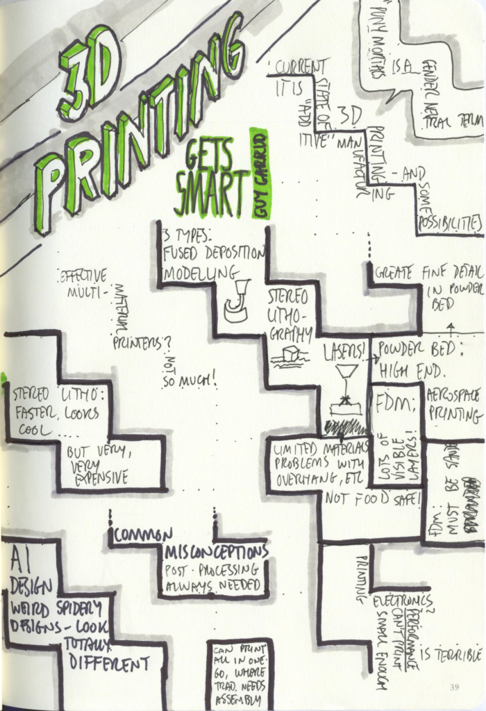
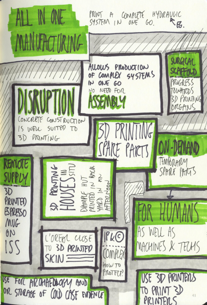
I nearly didn’t go to this panel, as I’ve heard a lot of talk about 3d printing over the years and it’s all got rather repetitive…  but I ended up attending due to either a gap or a full panel elsewhere (I forget which). I’m glad I did, as it managed to cover new ground whilst remaining grounded in reality. I’m not able to add much beyond what’s in the sketchnotes, so here they are!

Scanned sketchnotes from 3D Printing Gets Smart

Sketchnotes from 3D Printing Gets Smart (1 of 2)

Scanned sketchnotes from 3D Printing Gets Smart

Sketchnotes from 3D Printing Gets Smart (2 of 2)

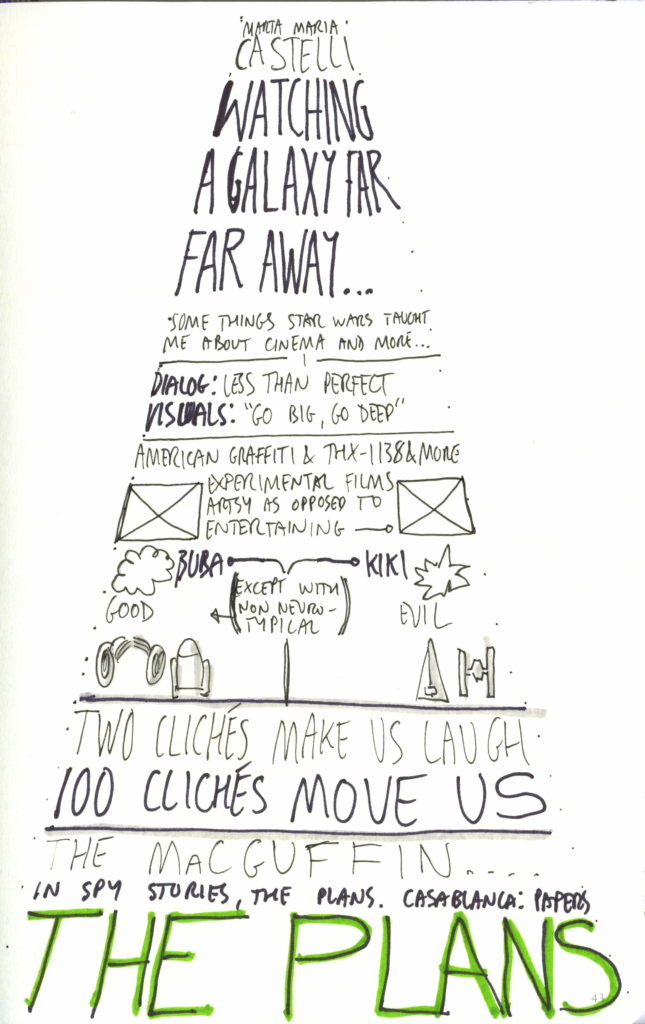
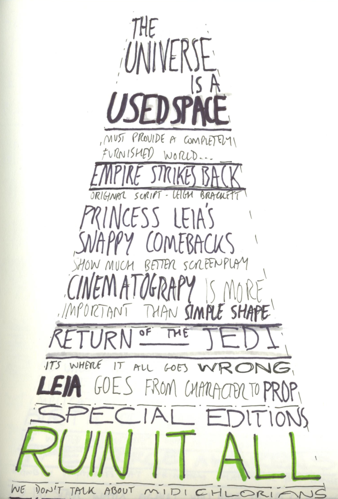
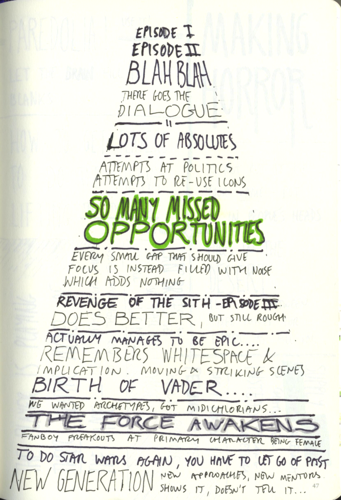
Watching a Galaxy Far, Far away

I wasn’t sure what to go to after the 3d printing session either.  I’d halfway assumed that anything star-wars focussed would be packed out (it often is) and that it might be a bit of slow or tedious listen – being a single-person presentation about that person’s personal experience of star wars.  But I wanted to go to something in this slot, and in the end, this was the least unlikely looking for me (the others didn’t look bad, to be clear, just not for me at that point in time, or involving a speaker or moderator I’d decided I’d heard enough of for the time being).

How wrong could I be!

Heartfelt, personal and loaded with interesting bits and pieces about both the star wars films and the times and culture the speaker grew up in – I think I’d say this was one of my high points of the con.  It’s certainly stuck with me more than some of the panel discussions did – and they were generally to a pretty high standard.

So, Marta Maria Casetti, well done!

It’s also stuck in my head pretty well as I planned to do a single page of notes, and so settled on a layout and theme with that in mind… and then had to repeat it in a hurry as the notes flew out onto the pages!  In fact, I was too slow with the pen to get a fourth page set in time to cover Rogue One – which was also discussed in the same manner.

Scanned sketchnotes from "Watching a Galaxy Far Far Away"

Sketchnotes from “Watching a Galaxy Far Far Away” (1 of 3)

Scanned sketchnotes from "Watching a Galaxy Far Far Away"

Sketchnotes from “Watching a Galaxy Far Far Away” (2 of 3)

Scanned sketchnotes from "Watching a Galaxy Far Far Away"

Sketchnotes from “Watching a Galaxy Far Far Away” (3 of 3)

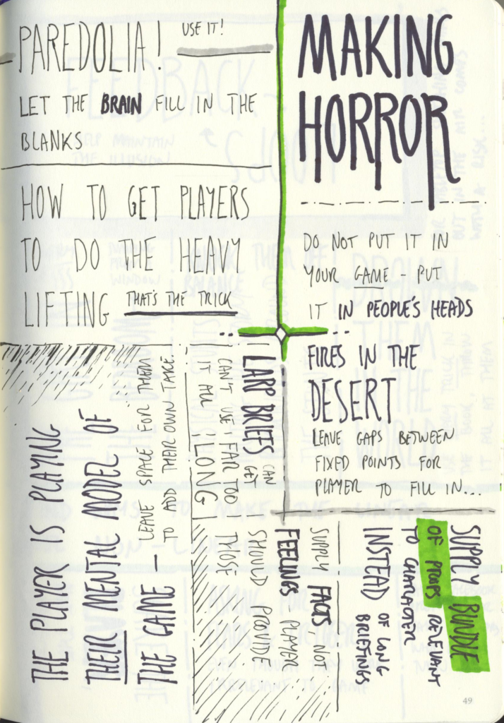
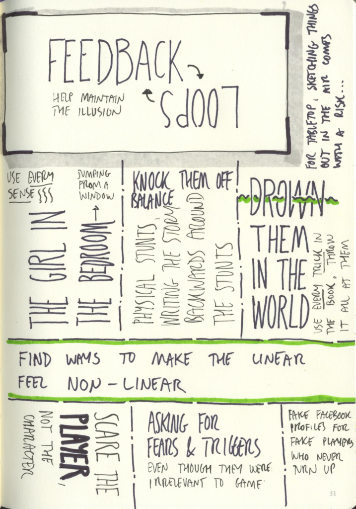
Making Horror – Hacking the Player’s Brain

A panel on techniques for making players experience horror in computer games, LARPs and beyond?  It’s like they saw me coming!

I’m going to let the sketchnotes speak for themselves here…

Scanned sketchnotes from "Making Horror"

Sketchnotes from Making Horror (1 of 2)

Scanned sketchnotes from "Making Horror"

Sketchnotes from Making Horror (2 of 2)

End of the Con

At that point, there were more things we could have gone to, but Katrina and I were both tired and had both just come out of panels we really enjoyed… so we decided to say a few goodbyes to folk around the con and start our journey home.

Going out on a high note was a better plan than trying to cling on the to the very end, especially as the next slot looked slightly sparse for both of us.  We’d both have been able to find something to hold our attention in the remaining few slots, but felt it was better to call it a day and brave public transport whilst still able to function.

Thus ended Nine Worlds 2017 for us. We’re already looking forward to Nine Worlds 2018, even if it makes the mooted move to Birmingham!


Nine Worlds 2017 in sketchnotes – Part 2 – Saturday

The Power of Playlists

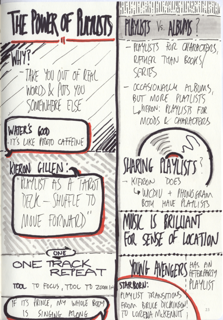
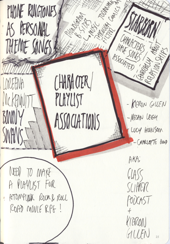
Did they really put Kieron Gillen on a panel first thing in the morning on the second day of the con? Was that wise? Even worse… it was in one of the rooms requiring complex investigative skills to find. Thankfully, the rest of the panel were also interesting folks – Megan Leigh, Lucy Hounsom and Charlotte Bond… aka The “Breaking The Glass Slipper” Podcast. Based on that panel, I will probably be checking out the podcast, too.

The general gist of this session was the four panellists talking a bit about how they use playlists in their writing process, and in particular, to help them get into moods, locations or characters.

Different creators leaned different ways, some preferring whole albums to track-by-track playlists…  some creating playlists for characters or locations, some who heard songs and just knew “I’m writing this now”.

Sometimes it starts with random associations, sometimes it starts with specific lyrics or specific moments. Much like the way I make associations between characters and music in gaming, only writ large and much more widely expressed.

There’s also a reminder to myself that I need to put together a playlist for a tabletop RPG I run… ran? Will run again? It’s been a while, but I want to get back to it!

For reference:

scanned sketchnotes - "The Power of Playlists" panel

Sketchnotes from the “The Power of Playlists” panel (1 of 2)

a second page of scanned sketchnotes

The Power of Playlists – Sketchnotes (2/2)

Access No Areas: Access Issues in Entertainment and Fandom

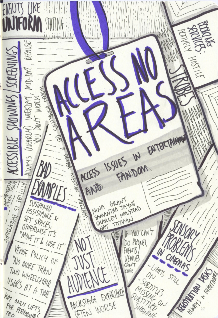
The sketchnotes here are largely a list of the problems mentioned. I will immediately apologise for any accessibility issues with this website – I do know better than to leave them there, but I fix web accessibility issues so much for the day job that I largely leave it to WordPress and their themes and UI here. This is my downtime activity, and I need to not be spending my whole life doing it.  I only have so much brain-space.  So, if this site has accessibility issues, please do let me know, but you’re more likely to have success by contacting WordPress.

Given the subject matter, here’s a bit more of a text summary of the content of the image:

  • Events like uniform seating, which doesn’t always work.
    My understanding of this one is that there’s a misguided idea that it’s required for fire regulations.  As far as I can tell, that’s not entirely true, although fire safety can be a concern with more freeform layouts.  It doesn’t mean they’re not possible, but it does mean it has to become somebody’s job to care, and they need to know what they’re doing…  which means you need to pay them for that knowledge.
  • Booking services are frequently actively hostile – if you can get through to one at all.  In my experience, they’re pretty hostile to anyone who uses them – not just those with particular requirements – but that doesn’t make it okay.
  • Strobes.  Just strobes.
    Interestingly, walking into this very room (albeit for a different session, I think) I spoke to Tech and pointed out an overhead light with a dodgy starter or bubble which was flashing at more than three times a second. This is particularly bad as that’s right in the “sweet spot” for photosensitive epilepsy and a bundle of other issues. The next time I was in the same room that light was dark. Nine Worlds has good tech crew.
  • Often a need for sustained assistance means you can’t do things.
    Sometimes, just having somebody help you into a space to do a thing isn’t enough – they need to stay with you in that space and be around you whilst you do that thing.
  • Often an ability to get by with only occasional assistance means you’re not disabled enough
    Venue staff have been known to spit out their dummy because somebody stands up from a wheelchair. “Miracle!”, they cry, “You are cured!”. Many wheelchair users can get up and walk – just not for sustained periods or in all situations. They are not “faking” just because they stand up.
  • Often venues have some accessibility support front-of-house, but none whatsoever backstage or on-stage
    I can second this.  In my past life as a techie, I have fallen down unmarked holes backstage, I have been hit in the head by invisible beams and I have been almost garrotted in the dark by neck-height dangling loops of cable.
  • Venue policies of “no more than two wheelchair users at once”
    I can see reasons.  They’re mostly bullshit reasons.
  • Less visible problems exist too!
    Not every disability is highlighted for your convenience.

There is more, but I can’t quite work out how to sum it up. Basically, if venues and organisers start thinking about some of this stuff, a lot of it is easy to deal with just by actually bothering to think about it!

Scanned sketchnotes from "Access No Areas" panel

Sketchnotes from “Access No Areas”

Lunch & Pop-up Market

These are both things which happened.  I can’t entirely remember what we did, and I skillfully resisted buying more RPGs that I would never find time to play. Although I was tempted!

I do wish I could find a way to make gaming fit in my life a bit better.

Redemption in Sci-Fi – From Vader to Teal’c to Aeryn Sun

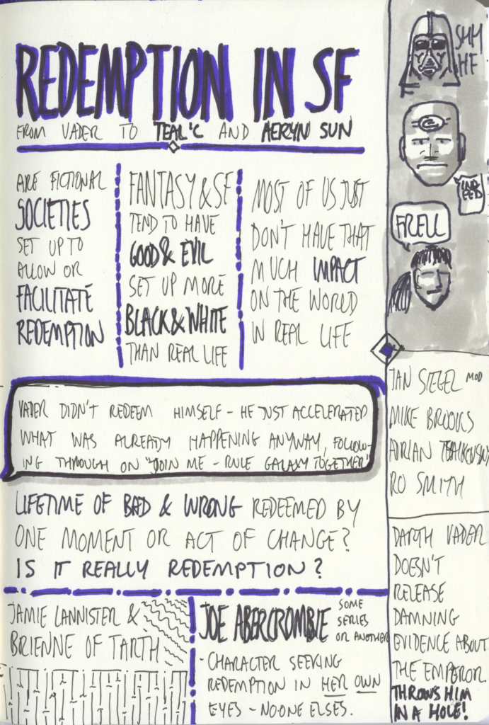
Another of those “we’ve got an idea for a panel, but we’re not entirely sure how to make it work” panels. Interesting, but a bit all over the place. Reading the panel description wouldn’t quite have been a stand-in for attending the panel itself, but it’d be close!

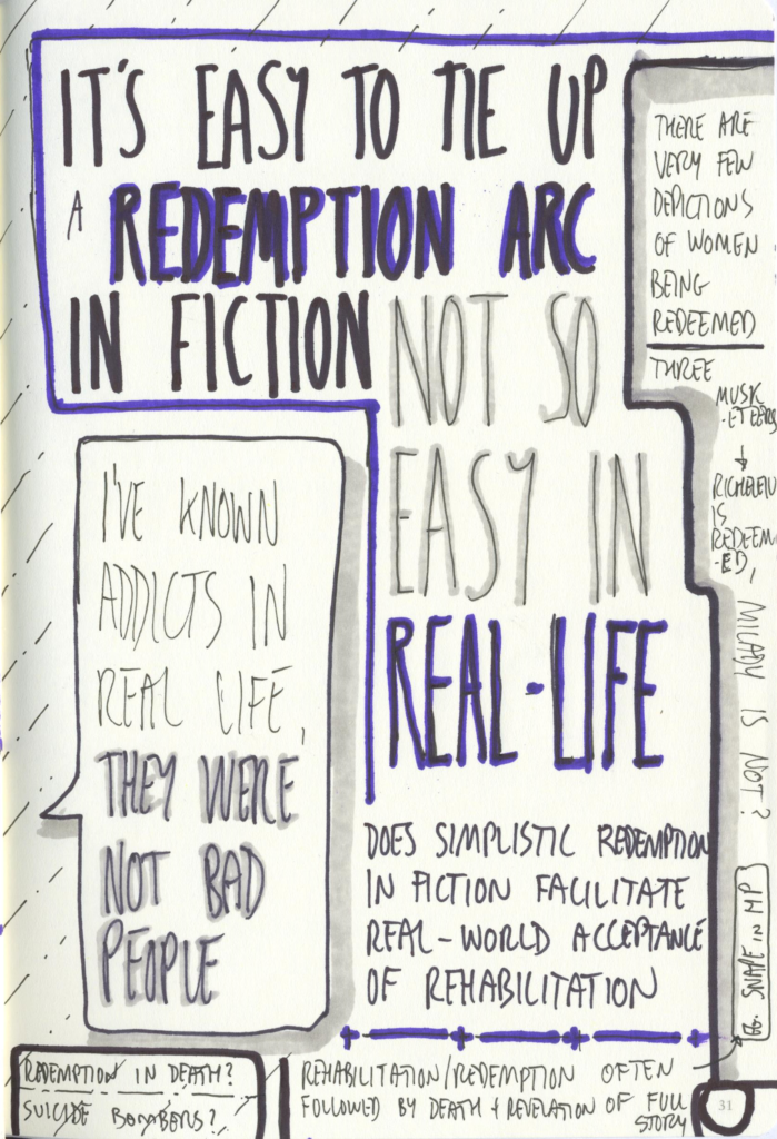
The one bit that wasn’t in the panel description, and which made it worthwhile for me, was a discussion of the gender differences in redemption arcs – there are remarkably few female characters with redemption arcs in their stories. They tend to die instead.

It was pointed out that that’s not uncommon for male characters either – redemption closely followed by a sacrificial death at a pivotal moment is a common trope…  but for female characters, it seems to be rarer.  More often, they stick to being evil to the end.

Scanned sketchnotes for Redemption in SF

Redemption in SF (1 of 2)

Creating Characterization in LARP

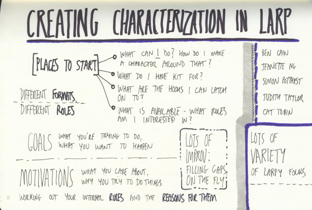
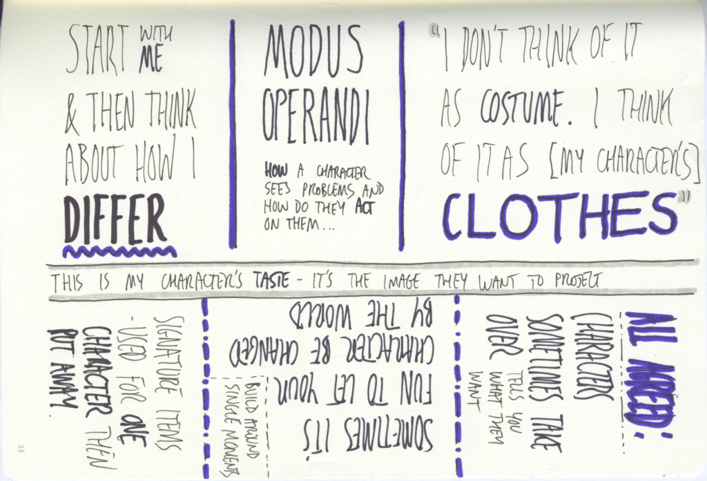
I went into this one worried that I wouldn’t get much useful advice… but I shouldn’t have.  More accurately, I was worried it wouldn’t provide me with new advice and would instead just talk about stuff I already know, but which goes out the window the moment I get to a game because anxiety is a git.

I shouldn’t have worried – it had plenty. Sure, it had plenty I had already thought of, but it had more too and was a fun panel along the way.


[EDIT – Moved some notes to Sunday]

It appears my notes were a little astray – and I had previously included “Limits of Horror” in my Saturday notes when it was actually on Sunday.  I’ve moved it accordingly.

A Word on Panel Moderation…

I’m not going to name names on the internet, but this was the day that made me start looking for certain people in panel descriptions and just not bother going to their panels unless I know there’s a really good moderator.

If they are the moderator then I’m just going to skip it, too. I’m pretty sure they don’t mean to, but they have a tendency to speak over and interrupt the rest of the panellists.  If they’re delivering a solo slot, I suspect they’d be fine.  If they’re on a panel with a good moderator, they’d be a great contributor…  but otherwise? Nobody else gets to finish a sentence, which not only scuppers my enjoyment of the panel but also clearly troubles the other panellists.

I’m putting it down to them having a style that doesn’t work for me, rather than anything else… and I know moderating is hard – especially when you have opinions.  I know this feeling well – I do contextual enquiry interviews in my day job. Sometimes in those, I have to sit there biting my tongue while the person I’m interviewing is being wrong about something I designed, or while they’re missing a plainly obvious thing that’s right in front of my face.

But still.

(No, Ed, I’m not referring to you!)

Thus ends Day Two – Saturday.  I’ll get to Sunday at a later date.

Nine Worlds 2017 in Sketchnotes – Part 1 – Friday

It’s that time of year again.  Nine Worlds, aka London Geekfest has just concluded, so I fire up the scanner and scan in all my scribbled sketchnotes… whilst also using them as a prosthetic memory to help me blog about this event.

I’ve been trying a slightly different style this year, which is slower at chewing through sketchbook pages, and more useful for me as an aide-memoire… but, as it turns out, looks slightly less cool when scanned in.  Ah well.  I’m learning this new style as I go.

About Sketchnotes…

Throughout the convention I had several people say “I wish I could do that” .  To which, in almost all cases, I have to say “you can”.

I’m far from the best at sketchnoting, and I’m largely making it up as I go along. If you look at my notes, you’ll see that I’m not especially skilled as an artist – particularly not when I’m powering through scribbling whilst trying to keep up with people’s speech.

There’s very little technical skill involved.  I mostly do it as it helps me stay focused on what’s being said, and helps me remember it afterwards far more than just writing down words does. Treating words and scribbles as pictures probably shoves it through some different bit of my brain, and doing that helps me remember it all.

I’m not going to say that your first few sketchnotes will look any good. Many of mine look pretty awful – and I’m fine with that.  They still serve their purpose, and I share them because people seem interested in them. I do sometimes “forget” to share the really bad ones, but mostly I even put up the ones which didn’t work out.  Sometimes with some edits.

That said, I did go to a half-day workshop on doing this a few years ago. So I did get some advice and was given some confidence.  I’ve forgotten most of it, and I’m yet to try using some of the advice I got from it.  I’m still learning as I go.

So – if you wish you could do sketchnotes… my advice is to start doing sketchnotes.  It’s not the most helpful advice, but it’s the best I can do right now.

Maybe I should run a sketchnoting workshop sometime, or at least write a post about the things I pay attention to while doing it.

Meanwhile, on to the con report and sketchnotes…

Continue reading

Mocktails!

Recently, I had the honour and privilege of being Best Man for a friend’s wedding. Which meant, amongst several other things, I was required to provide a stag do.

Easy, you might think. Piss up in a brewery level of ease.

But no.  Not unless breweries come in teetotaller friendly form.

Continue reading

Recent Reading – The Long Way To A Small Angry Planet & A Closed and Common Orbit

It’s actually been a while since I read these books – my time has been eaten by a pile of other things, including but not limited to: Christmas, birthdays (not mine), holidays, moderately punishing work schedules and getting married on two continents (one wedding, to the same person, but with one half of the wedding in the UK, the other in New Zealand) and having a supporting role at a friend’s wedding.

This means that I’m going to struggle to say much – partly because of time and partly because of spoilers.  But I’ll say what I can.  There will be some spoilers, though – particularly for the second book.

I’m going to start with “The Long Way To A Small Angry Planet” and then move on to “A Closed And Common Orbit”, both by Becky Chambers.

Continue reading

Recent UX Reading – Build Better Products

After listening to the “What is Wrong With UX?” podcast (from Kate Rutter and Laura Klein) for a while, I recently picked up the book the hosts have been relentlessly shilling (and writing or contributing to) since the dawn of time start of the podcast.

But to start with, before I get onto the book (Build Better Products by Laura Klein), I’ll mention the podcast a bit more.

They introduce it every time as “The podcast where two old ladies yell at each other about how to make products suck slightly less”, and typically conclude by complaining about how they’ve run out of booze.

If you’re a UXer who likes talking about UX a) in a frank, open manner and b) in a pub, this might be a podcast for you.  They have a cynicism which is oddly refreshing in this particularly shiny and glossy field, and I’m pretty sure I’ve been to workshops presented by one or both of them at some point.  One of them probably helped me get into sketchnoting… which you might have noticed included in some of my other posts.

So.  The book.

It’s a no-nonsense, clear and straightforward guide to UX processes, which (for a nice change) acknowledges that some of us are in-house UXers working in the enterprise space, and so have to live with our work for years (decades!) in a way that just doesn’t happen the same way in the consumer world.

There are parts of if which I’d describe as leaning towards “my first UX” or “teaching grandmother to suck eggs”, but they’re wrapped in a mountain of useful advice and sane ways to make some fairly weird and wonderful UX practices actually make sense to business users and developers.

Really, I ought to wait until I’ve finished reading the book before blathering on about it, but this time I decided not to.  Why?  Because it’s that good.  Because not only does it make sense to me in the UX field, but it’s also written in a clear and concise way that managers, directors and developers will understand and find useful as well.

It’s not about putting some UX next to your product, or trying to smear it on at the end.  It’s about baking UX design thinking in throughout the life-cycle of the product.  From identifying user needs, through promoting behaviour that supports and addresses them and on to validating assumptions, measuring outcomes and then iterating based on what you find.

I’ll be making sure a copy gets added to our office library, and quite possibly demanding that our product management team, senior developers and architects get locked in a room until they’ve read it.  If you’re a UXer who works with other human, read it.  It’s a breath of fresh air. Written with the same combination of capability, realism, pride and self-effacing humour that the podcast has, it manages something that most UX books have utterly failed at: It provides an enjoyable and memorable reading experience.

If you work with a UXer and don’t really know what they actually do or why they keep asking weird questions and going off sideways from problems, you could do a lot worse than picking this up.

Recent Viewing – Arrival

Stepping away from writing about my recent reading, I’m going to talk about some recent viewing.

Arrival.  Based on a short story by Ted Chiang (“The Story of Your Life”), this is a film built around the Sapir-Whorf Hypothesis – which I’ll summarise as the idea that languages you learn shape the way you think and perceive the world.

The film focuses on a first-contact situation in which a number of alien vessels arrive on earth, and the efforts made by both us and the aliens to both understand and be understood.

Those efforts are made more complex by some differences in perception which are not apparent at the start of the film, but gradually become so as things progress.

Amy Adams does a fantastic job of portraying somebody who is struggling to understand and come to terms with grief, whilst also working to understand a literally alien language… a written language which is changing her perception as she learns to understand it and use it to interact with those who use it as their sole meaningful medium of communication.

It’s a slow paced, cerebral science fiction film. Whilst is has aliens (two onscreen), gunfire and explosions (well… explosion), it’s about as far from Independence Day as it’s possible to get. If you go in expecting an action-fest, you’re not going to come out with that expectation fulfilled.

This film has a small but strong core cast (Amy Adams, Jeremy Renner and Forest Whitaker) who all do a fantastic job of being who they’re meant to be, but it’s Adams who really shines in a role that needs to display a more complex emotional state than is immediately apparent at the start of the film.

It also has some well thought out production design.  The alien-ness interior of the extraterrestrial vessel is cleverly portrayed, and the way that the story moves between the vessel and the research camp built up around it helps keep things tight and a little claustrophobic whilst also injecting a bit of comprehension and decompression time into the film.

If you like smart, earth-based, first-contact SF then you should absolutely go and see this at your first opportunity. Avoid plot summaries. Hopefully my description above is vague enough to avoid being too spoiler heavy.

If I had to give a rating, I’d give this a full-on 10/10, with a note that I want to see it again to see how my perception changes.  I suspect I may find it rewarding.

« Older posts

© 2024 Eggbox

Theme by Anders NorenUp ↑