Eggbox in Transit - soon to be settled again!

Category: Design

A mini-rant about “Delight” abuse in UX

I started writing this blog post over a week ago, but it stalled as I was hitting a bit of a mental wall with it. But then I saw this tweet, which summed it up nicely.

Just add “Delight” or “Delighters” to the bottom of that list. I’ve been feeling a lot of backlash from the UX world against them, which isn’t vastly surprising given the amount of complete hogwash which has been vomited forth about them.

But it does bug me. It’s another example of people who don’t really understand domain-specific terminology latching onto it, unwittingly abusing it… and then the “experts” deciding to blame the terminology and models instead of stepping back and thinking “how can we help people grok this better?”

The Kano Model is at the core of this terminology, but Maslow’s Hierarchy of Needs is a handy reference too.

The Kano Model

The Kano Model, Showing Change over Time.
Image By Craigwbrown (Own work)
CC BY-SA 3.0,
via Wikimedia Commons

But Dr. Noriaki Kano didn’t use the word “Delighter” originally, as far as I can tell.  The paper it’s all based on [Kano, N., Seraku, N., Takahashi, F., and Tsuji, S. 1984. “Attractive quality and must-be quality,” Journal of the Japanese Society for Quality Control (14:2), pp 147-156] uses “Attractive Quality”, and is mostly focussed on the following:

  • Attractive qualities give a satisfaction boost if they’re present, but their absence doesn’t cost anything.
  • Performance qualities give a satisfaction boost if strong but have a satisfaction cost if they’re weak.
  • Must-have qualities lower satisfaction if they’re not present, but their presence doesn’t give a boost.
  • Features move down that list over time. Attractive qualities gradually become performance qualities and then must-have qualities as they become more common and more people just expect them to be there.

I think the words “Delight” and “Delighter” were brought in later as a way to clarify what is meant by an attractive feature, but I could be wrong about that.  I’ve been unable to actually get hold of the original article to check – so apologies to Dr Kano if that’s incorrect.

The Problem

Before its use in UX land, I understand that the word “delight” in this context came from the hospitality business.  It came from the idea that just doing what was expected wasn’t enough to stand out.  Nor was doing all the typical “we’re a classy hotel” optional extra things because all the other classy hotels did them too.  You had to do everything which was expected by default, then do everything which might be considered as optional and then do something extra – something above and beyond.

The “bit more” on its own doesn’t cut it.  You’ve still got to do all the stuff before it. If you haven’t covered off the baseline stuff, it’s wasted effort and adds insult rather than delight.

It’s like building a ladder with only a top rung: of course it’s useless. It shows a fundamental misunderstanding of both the goal and the Kano Model. But that ladder is exactly what I keep seeing built, and then I hear complaints that blame the Kano Model and its delighters for it.

A fair number of people just saw the words “delighter” or “delight” and latched onto it, focusing on trying to create delight to the exclusion of all else. Because that always ends well.

The problem is that if all you have are delighters or attractive qualities, you’re in a situation where you have none of the other stuff.   I can assure you, whatever your designing, there will be some of the must-have qualities you are missing.

Think about the pyramid view of Maslow’s Hierarchy of Needs (with or without the popular additional “wifi” layer – this works either way).  This is a somewhat related idea.  That hierarchy works on the basis that the lower down needs must be satisfied before the higher up needs become meaningful, stable or sustainable.  Maslow’s idea was that the lower layers must be fully met before the higher layers can be achieved – without them, the pyramid collapses.

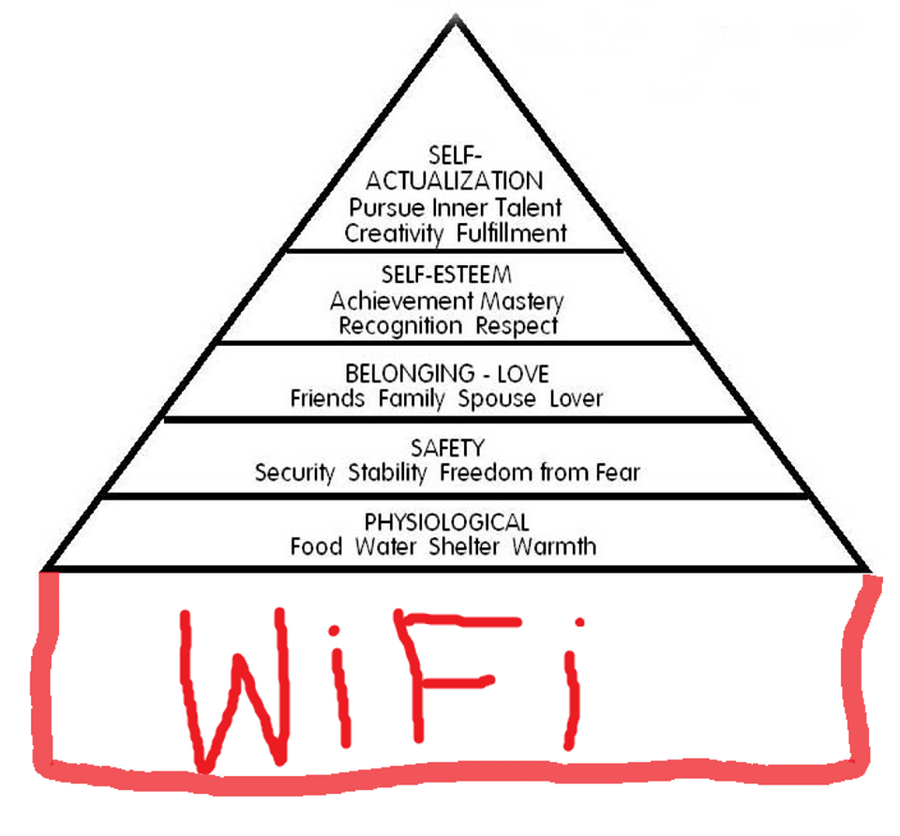
Origin unknown – I found it here: https://www.pinterest.co.uk/pin/552253973027755278/?lp=true

That idea is baked-in with the Kano Model too.  The satisfaction gained from one or two delighters or attractive qualities being present will be massively undermined by the absence of all of the must-have qualities and performance qualities.


Fancy wine with a personalised label and a box of chocolates might be a nice touch in your hotel room, but if the room is covered in faeces and crawling with cockroaches then it isn’t going to make your stay delightful.  It’s going to be insulting.

It’s only a delighter when placed in the context of everything else that might be considered having also been done!  Without that context, it’s just an inadequate attempt at a bribe.

But what really gets my goat…

It’s not really that exclusive focus on delight that annoys me, although it certainly doesn’t help.  That’s just the problem of a buzzword-heavy discipline which, on a superficial level, looks like an easy way to make a buck.

The UX industry will always attract people who’ll exploit the gullible by throwing buzzwords at them in exchange for money. They bug me, but what bugs me more is the misguided backlash from the people in the industry who should know better. The backlash against the models and techniques that are being abused and misapplied, whose names are being taken in vain.

I’m starting to see and hear UXers in positions of authority denigrating the Kano Model for being focused on the frivolous idea of “delight” to the exclusion of all else.

I don’t like it when people who don’t know the origins or meaning of domain-specific terminology muddle it with casual language.  It leads to a watering-down of ideas.  But I understand it and understand why it happens. You fix it by explaining and sharing understanding.  At a minimum, you just suck it up and cater for the terminology difference by using the appropriate terms for each audience.

But the backlash against the model itself because people don’t bother to properly understand it? Nope. Let’s just stop doing that, please.

Let things be things

The Kano Model is a model.  It’s a simplified abstraction.  It’s a useful model, but that’s all it is. While it’s useful, it’s not a world-encompassing ideology.  It’s a tool. I strongly suspect it didn’t come around to your house and force it’s filthy delighters into your face, shouting “DELIGHT! DELIGHT!”.

People who didn’t know better did that bit (not literally, I hope).

We can train most of those people out of abusing the models and terminology. We might even end up with more good designers as a result. But if we blame the models and terminology and steer people away from using them instead of understanding and explaining them better, we might as well give up and all go home.

Let’s not do that. Let’s just learn, use and teach our tools better.

Antagonism Required

Two Bad Words

Nothing turns a design to crap faster than a certain two words.  They are the bane of my professional life. They are a signifier that work I’ve done is either the wrong work, the right work done at the wrong time or the right work done for the wrong people.  They are, without fail, the worst words to hear in response to a request for your work to be reviewed.

The words in question?

“Seems Fine.”

Give a shit

There are other words that can be similarly bad, but “Seems fine” basically boils down to “this was not important enough for me to give any time to”.

If it’s a design review, and you’re seriously and honestly not able to see any problems then shout it from the rooftops.  You have found the perfect, shining unicorn. Hand that designer all the money in the world and tell everyone else to retire because they are done.

If you are involved in a design process, be involved. Merely being present is not good enough. In the event that it’s not so perfect that a life of perpetual ecstasy would disappoint, say something.

If you don’t give a shit, you’re in the wrong place.  I don’t care what job you actually do, but if you don’t care enough to do more than phone it in then be up-front about it.  Remove yourself from the process.

Push Back

If you do give a shit, then push back.  It’s not even about disagreeing.   It’s about making sure that the design stands up.  A rough design that you agree with still needs to be challenged, otherwise that rough design is what you’ll ship.

All design thrives on creative tension – you can usually produce “good enough” without it, but is “good enough” all you want? Do you really want to ship your designer’s first draft?  They sure as hell don’t you to.

Constraint

A request for a design to be reviewed is a request for one of the following:

  • Information to inform or further constrain the next iteration of the design
  • Information to inform the complete restart of the design within different contraints
  • Confirmation that the design is the best it can be, given the established constraints

A first draft is more interview technique than design

I always consider my first-draft to be an interview technique rather than a design. It’s a means to gather more information about what’s needed and refine the direction, rather than an actual attempt to deliver a solution.

The sacrificial first-cut is a long established way to tease out other people’s ideas. People are a lot more able to articulate what they’d rather see than they are to articulate what they want in the first place.

If you don’t push back, then you’re committing to a shot-in-the-dark.

Constraint

Design is all about constraints. Without constraints, all problems are trivial and solutions are obvious. Design, as a process, works best when the current result of that process is challenged and pushed to improve.

One of the best ways for that push to come is from tightening and refining the constraints – from speaking up when something is not good enough.

If everything is good enough from the outset, you’ll never get to actually good.

Summing Up

If you take one thing away from this post, take this:  If you’re meant to be involved in a design process, be involved or acknowledge that you’re not, acknowledge what that means and step away.

One up, One Down

Half finished posts from the unpublished archives:
I’m pulling this post out and making it live largely unedited.  This is because it’s been sat there a fair while and I thought the idea deserved to be put up, even if the post isn’t ready for prime time…

Anybody who’s worked in software know that one thing is virtually impossible to get: Positive feedback.  You’ll get negative feedback up the wazoo, but meaningful positive feedback is a right bugger to get hold of.

So how about we start asking for it more?  We’re always very good about inviting people to tell us what we’re getting wrong, but we’re also terrible about asking what we get right.

Why don’t we have a bug reporting tool that’s specifically designed on a “one up, one down” basis?  The idea here isn’t that you can’t submit bugs without giving praise too, but that giving meaningful, useful positive feedback gives the bugs you raise a higher priority. Yes, folks, I’m talking about bribery.

Raise a lot of bugs without giving any commentary about what we’re doing right?  Well, you’ll still get help, but we’d prefer it if you engaged with us on a less superficial level.  Tell us what you like.  We probably already know about the stuff you hate – we probably hate it too, but can’t get it on the table to fix it.  What we’re less clear on is if you’ve used the bits we don’t hear about.

As things stand, If you’re not complaining, it could go either way.  Either things are not bad enough to make you complain, or they’re so bad that you’ve stopped using those features and so have nothing to tell us about them.  We can’t know for sure.  “We’re pretty sure it’s not bad enough to make people complain” isn’t a great marker for design to aspire to.  There’s a big difference between “we got that right” and “we either did okay or did so badly nobody’s using it”, and being able to tell that difference would be nice.

Some Responses to “what does a good enterprise UX look like?”

My previous post generated a bit of commentary on one of the sites it syndicates to, so I thought I’d post them up here and follow up with a bit of response.

From Themadone:

“I think my answer would be that it should not feel like you’re trying to roll a large rock up a hill. With the obvious associated problems of something going wrong and you ending up at the bottom with a large rock on your face. Or finding the rock is stuck on something that you can’t readily see or do anything about.”

From Nojay:

“For various reasons my workflow involves an older graphics editing package, an esoteric OCR package, several web apps, another graphics package for review and testing and a batch image processing package for final release. I have to remember that “Paste” is Alt+F+W or [Shift+Insert] when editing, for the OCR package it’s [Ctrl+B] and for review it’s the classic [Ctrl+V]. Enterprise software MUST NOT work like this.”

I’ll acknowledge that I’m quoting a bit selectively in places, but can you spot the commonality between those responses? It’s been common with the verbal responses I’ve had too…

There’s a strong focus on what a good Enterprise UX isn’t.  The field is so bad that just not sucking is enough to be seen as a good experience.  That’s a pretty low bar.  It’s like having your personal best at the high jump being “didn’t tunnel underground”.

A couple of other responses did stray away from the negatives towards the positives – which I wasn’t really expecting.  I did my readership a disservice – which was nice to discover.  Some more selective quoting:

More from Nojay:

“That implies a consistent interface between apps with seamless switching and information transfer.”

From Katlinel*:

“Imperceptible? That is, the software enables you to accomplish the tasks you need to do, without getting in the way of those tasks. The software should facilitate this and not provide stumbling blocks that impede the user.”

From Cryx:

“At the moment user experience is often done like going to a convention. You open the door and there is a hubub of options. You may have a guide to the event, but you have to pick your way around to the areas of interest, and slowly fill up your bag with the info you want.”

“It should be more like you are the VIP. You say ‘I want X done, by X time’ and people scurry away and work out the best way to make it work for you. They come back and present the plan/information to you. They don’t go on at length about all the work they did, and keep asking you small questions. However if you bring your laser focus to a task they can tell you each step, and will let you modify things quickly and without fuss.”

From those it becomes clearer.

Good Enterprise UX plays nice

No enterprise software application exists in isolation – everything is just a step in somebody’s workflow, and needs to fit into that workflow.  Each enterprise application is there to fill a step, or some steps, or every step of somebody’s workflow… even if it’s not providing an end-to-end workflow, it’s still part of one and it needs to play nice with its neighbours.

It becomes clearer that enterprise software needs to not be a bottleneck or a hurdle.

Good Enterprise UX works for you

I particularly like the analogy in the final quote – about enterprise UX needing to be more like a concierge or a team of employees, being ready with what you need when you need it… but also serving a large number of users. I’d like to take it further, though – for common behaviours, I don’t think I should have to ask.  The software should know who am and what I do – all of that information is available within an enterprise anyway.

If it’s being like a concierge, it should be a really good concierge who can anticipate my needs and have prepared some information ahead of time.  I should be able to start my interaction with that software by being greeted with a clear picture of what’s going to be relevant in that interaction, to pick and choose from and add to if needed.

So, the comments exercise this time is slightly different.

In your day job, you almost certainly use some kind of enterprise software.  If the UI for it was a very, very good (human) concierge or PA, what would it be doing for you?

Please let me know either as comments where you see this post, on the original blog post at www.eggbox.org.uk or however you like on social media – but please tell me where so I can read!

What does a GOOD enterprise user experience look like?

It’s been a fair while since I posted on here, so I thought I’d try kicking off again with a question, and then see what comes back.  But, because not everyone works in the same field I’d better define some terms first:

Enterprise Software is software designed to serve the needs of an enterprise (typically a larger business) rather than an individual, although individual human users still have to use it and may have multiple different jobs to do which require them to use it.

User Experience is what you have when you are one of those individual human users being forced (it’s rarely a choice you’d make on your own) to use it.

So, on to the question:

What does a good enterprise software user experience look and feel like?

Answers in comments please. Or on your own blog or social media of choice, but let me know about them here.

Design Iteration isn’t just about the good ideas…

At work, I keep hammering on to people about how design is an iterative process.  How it’s not something that you do once at the start of a project and then never touch again.  Mostly my colleagues seem to get that and run with it, but occasionally I get farmed out to elsewhere in the company, where I find stark reminders of how much progress the team I usually work with have made.

The big eye-opener is to work with people who’ve never had the opportunity to learn about good design or how to shape a user experience.  Going right back to the basics like that reminds you of a few of your core ideas, and forces you to find new ways of expressing them.  On my most recent such excursion, I became a lot clearer about an idea I already knew and understood:

Good design is as much about the bad ideas as the good ones.

Bad ideas happen.  There’s no way around that.  They happen, and they chew up time and resources before they either finally get identified and cut away, or they get munged around until they’re workable.  In the really bad cases, they linger for a long time and chew up all that’s good about a project, leaving only an enthusiasm-free husk.

I’ve generally found that the bad ideas that hang around the longest are the ones that come out latest in the project… the ones that looked good when somebody suggested them at the 11th hour, and which grabbed all the remaining free time.  The ones that became somebody’s pet idea, which they couldn’t let die because they’d invested too much time already.  The “fixer-upper-opportunity” style time-and-money sinks that just seem worse every time you look at them, but that you can’t step away from because you don’t have the resources to start again.

It’s those ideas that are why I’m a big fan of collaborative, rapidly-iterating design processes early in a project.  To find the bad ideas, and to find them early.

The early stages of design are often referred to as “exploration”, and that’s an extremely appropriate word.  Exploration isn’t just about finding your way somewhere or finding the things you want… it’s also about finding and avoiding the pit traps, blind alleys and quicksand.  It’s not just finding the destination, but about avoiding the  hazards whilst doing so.

Good design isn’t just about making sure you build a perfect picnic bench.  It’s also about making sure you don’t build it on an ant colony, next to a sewage plant or halfway down a firing range.

So, folks, make sure you spend enough time identifying bad ideas… just so you know where they live and you can avoid straying too close to them by accident.


© 2024 Eggbox

Theme by Anders NorenUp ↑